


How to Design a Resume in Word That Gets You Hired
In today’s competitive job market, your resume is your first impression. It’s your chance to showcase your skills, experience, and qualifications to potential employers. While the content is crucial, the design of your resume plays a significant role in capturing attention and making a positive impact. This guide will provide you with the knowledge and tools to design a compelling resume using Microsoft Word, optimizing it for readability and applicant tracking systems (ATS), and ultimately, helping you land that coveted interview.
Understanding the Importance of Resume Design
A well-designed resume isn’t just aesthetically pleasing; it’s a strategic tool. It needs to:
- Be Readable: Easy to scan and understand, allowing recruiters to quickly grasp your key qualifications.
- Be Organized: Present information in a clear and logical structure, guiding the reader through your experience.
- Highlight Key Skills: Emphasize the skills and experiences most relevant to the target job.
- Be ATS-Friendly: Avoid design elements that can confuse or break down applicant tracking systems.
- Reflect Your Professionalism: Present a polished and professional image of yourself.
Step-by-Step Guide: Designing Your Resume in Word
Let’s walk through the process of creating an effective resume in Microsoft Word:
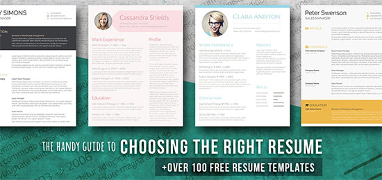
1. Choose a Resume Template (or Start from Scratch)
Word offers a variety of pre-designed resume templates. This can be a great starting point, especially if you’re new to resume design. To access them:
- Open Microsoft Word.
- Type “resume” or “CV” in the search bar.
- Browse the available templates and select one that aligns with your needs and the type of jobs you’re applying for.
If you prefer to build from scratch, you’ll have complete control over the design. However, remember to prioritize readability and ATS compatibility.
2. Formatting Your Document for Readability
- Font Choice: Stick to professional, easy-to-read fonts like:
- Arial
- Calibri
- Times New Roman
- Garamond
- Avoid overly stylized or decorative fonts.
- Use a font size between 10 and 12 points for body text.
- Margins: Set margins to 1 inch on all sides. This provides ample white space for readability. Go to “Layout” -> “Margins” to adjust.
- Line Spacing: Use single or 1.15 line spacing for the body text. This keeps the document clean and easy to scan.
- White Space: Utilize white space generously. It prevents the resume from looking cluttered and helps draw attention to important information.
- Alignment: Use left alignment for body text. Justified alignment can create awkward gaps between words and is less readable.
3. Structuring Your Resume: Key Sections
A well-structured resume makes it easy for recruiters to find the information they need. Common sections include:
- Contact Information: Your name, phone number, email address, and (optionally) LinkedIn profile URL.
- Summary/Objective (Optional): A brief overview of your skills and career goals. (A summary is generally preferred for experienced professionals; an objective is often used by entry-level candidates.)
- Skills: A list of your key skills, categorized for easy scanning.
- Experience:
- List your previous roles in reverse chronological order (most recent first).
- Include job title, company name, dates of employment, and location.
- Use bullet points to describe your responsibilities and accomplishments.
- Use action verbs to start each bullet point (e.g., “Managed,” “Developed,” “Implemented”).
- Quantify your achievements whenever possible (e.g., “Increased sales by 15%”).
- Education: Include your degrees, certifications, and relevant coursework.
- Additional Sections (Optional): Projects, awards, volunteer experience, publications, etc. Tailor these sections to the specific job and your relevant experience.
4. Utilizing Design Elements Effectively
- Headings: Use clear and consistent headings (e.g., “Experience,” “Skills,” “Education”) to separate sections. Consider using bold text for emphasis.
- Bullet Points: Use bullet points to break up text and make information easier to scan. Choose a simple, consistent bullet point style.
- Lines/Dividers: Use horizontal lines to visually separate sections and improve organization. Avoid excessive use, as it can clutter the design.
- Color (Use Sparingly): A touch of color can make your resume stand out, but use it judiciously. Stick to a professional color palette (e.g., blues, grays, greens) and avoid excessive color.
- Avoid Tables (Generally): While tables can be used for formatting, they can sometimes cause problems with ATS. Use tabs, spaces, and headings to organize your information instead.
5. Optimizing for Applicant Tracking Systems (ATS)
- Plain Text is Key: Avoid complex formatting, such as images, graphics, tables (whenever possible), and unusual fonts.
- Use Standard Headings: Stick to common headings like “Experience,” “Skills,” and “Education.”
- Keywords are Crucial: Carefully review the job description and incorporate relevant keywords throughout your resume.
- Save as .DOCX: Saving your resume as a .docx file is generally the most ATS-friendly format.
- Test Your Resume: Some online tools allow you to test your resume’s ATS compatibility.
Proofreading and Editing
Before submitting your resume, meticulously proofread it for:
- Typos and grammatical errors.
- Consistency in formatting.
- Accuracy of information.
- Relevance to the target job.
Ask a friend or colleague to review your resume for a fresh perspective.
Conclusion: Crafting a Resume That Gets You Noticed
Designing a compelling resume in Microsoft Word is achievable with a thoughtful approach. By understanding the importance of design, following the steps outlined above, and prioritizing readability, organization, and ATS compatibility, you can create a resume that effectively showcases your qualifications and helps you stand out from the competition. Remember to tailor your resume to each job application and continuously refine it based on feedback and results. Good luck in your job search!
FAQs: Frequently Asked Questions
1. Should I use a resume template from Word?
Yes, using a Word template can be a great starting point, especially if you’re new to resume design. However, be sure to customize the template to reflect your personal brand and ensure it’s ATS-friendly.
2. What font should I use for my resume?
Stick to professional, easy-to-read fonts like Arial, Calibri, or Times New Roman. Use a font size between 10 and 12 points for body text.
3. Can I use color in my resume?
Yes, but use color sparingly. A touch of color can make your resume stand out, but stick to a professional color palette (e.g., blues, grays, greens) and avoid excessive color.
4. How do I optimize my resume for Applicant Tracking Systems (ATS)?
Use plain text formatting, standard headings, incorporate relevant keywords from the job description, and save your resume as a .docx file. Avoid complex formatting elements that may confuse the ATS.
5. How long should my resume be?
Generally, a resume should be one to two pages long. For entry-level candidates, a one-page resume is often sufficient. Experienced professionals may need two pages to showcase their extensive experience.
